A logo is more than just a symbol , it’s your brand’s visual heartbeat. Whether it’s splashed across your website, business cards, or social media feeds, your logo tells your audience who you are before they read a single word. But here’s the real design challenge: how do you create a logo that looks powerful and consistent in multiple colors?
This is where art meets strategy , and where your brand’s versatility begins to shine.
Why Color Versatility Matters in Logo Design:
Color plays a vital role in shaping how people perceive your brand. Think about it: the red of Coca-Cola, the blue of Facebook, or the rainbow of Google , each one communicates something distinct.
But a great logo doesn’t rely on just one color. It should be flexible enough to shine in full color, black and white, grayscale, or even a single accent tone. This adaptability ensures your brand remains recognizable across any background, surface, or medium , from digital screens to embroidered merch.
A color-versatile logo:
• Keeps your brand consistent across multiple touchpoints.
• Adapts beautifully to light and dark backgrounds.
• Works in both print and digital formats.
• Retains impact, even when stripped to minimal tones.
The Art of Designing a Multi-Color Logo:
When creating a logo that stands out in multiple colors, balance and intention are key. Too many hues can overwhelm the eye; too few may limit expression. Here’s how professional designers approach this:
1. Start with a Strong Foundation
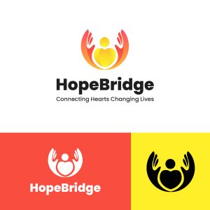
The best multi-color logos begin in black and white. Why? Because if your logo doesn’t work in monochrome, it won’t stand strong in color either. Focusing on form first ensures that the design remains visually effective no matter how it’s colored later.
![]()
2. Define Your Color Strategy
Each color you choose should have purpose.
• Red evokes energy and passion.
• Blue conveys trust and professionalism.
• Yellow suggests optimism and creativity.
• Green reflects growth and harmony.
A good designer doesn’t just pick colors that look nice together , they craft a palette that aligns with your brand’s story, personality, and audience.
3. Limit, Then Layer
Limit your palette to two to four primary colors. This keeps your logo simple, recognizable, and scalable. From there, use gradients, overlays, or tone variations to introduce depth , without losing visual clarity.
4. Consider Every Background
A multi-color logo should adapt seamlessly to any backdrop. Designers achieve this by:
• Creating dark and light mode versions.
• Using transparent and solid-color backgrounds.
• Testing visibility on screens, print materials, and merchandise.
The result: a logo that never loses its punch, no matter where it appears.
 5. Keep the Meaning Intact
A color change should never alter your logo’s meaning. The core concept the shape, typography, or symbol , must remain recognizable whether it’s in a vibrant gradient or a single shade of gray.
Creative Examples: Multi-Color Done Right
This is where design creativity truly shines. Many of today’s top brands use multiple colors strategically:
• Google uses four primary colors to express diversity and innovation.
• NBC’s peacock showcases six colors representing its wide variety of programming.
• Slack’s new logo simplified its palette but maintained a playful, multi-hued identity that still feels vibrant and modern.
Each of these examples proves one thing: color versatility doesn’t mean chaos , it means controlled creativity.
Designing for the Future: Adaptive Logos
As design trends evolve, logos must now work across dynamic digital environments , websites, social apps, and even dark-mode interfaces. This makes adaptive logo design more relevant than ever.
Creating a multi-color logo today isn’t just about visual appeal; it’s about future-proofing your brand. Your logo should look equally sharp on an Apple Watch screen as it does on a billboard. That’s where the right design agency , with a keen understanding of color theory, digital consistency, and modern aesthetics , makes all the difference.
Ready to Build a Logo That Pops in Every Color?
Your logo is your brand’s signature ,let’s make sure it shines in every shade. At flyers4u we design visually powerful, color-adaptive logos that tell your story, reflect your values, and elevate your brand across every platform.
Let’s bring your brand to life , in color.
Contact flyers4u today to start your logo design journey with our creative team
Featured image by on Flyers4u