Our logo designs are more than visuals — they’re brand identities built to tell a story. Each logo is thoughtfully crafted to capture the essence, purpose, and personality of every business we collaborate with.
Creative / Brand-Story Style
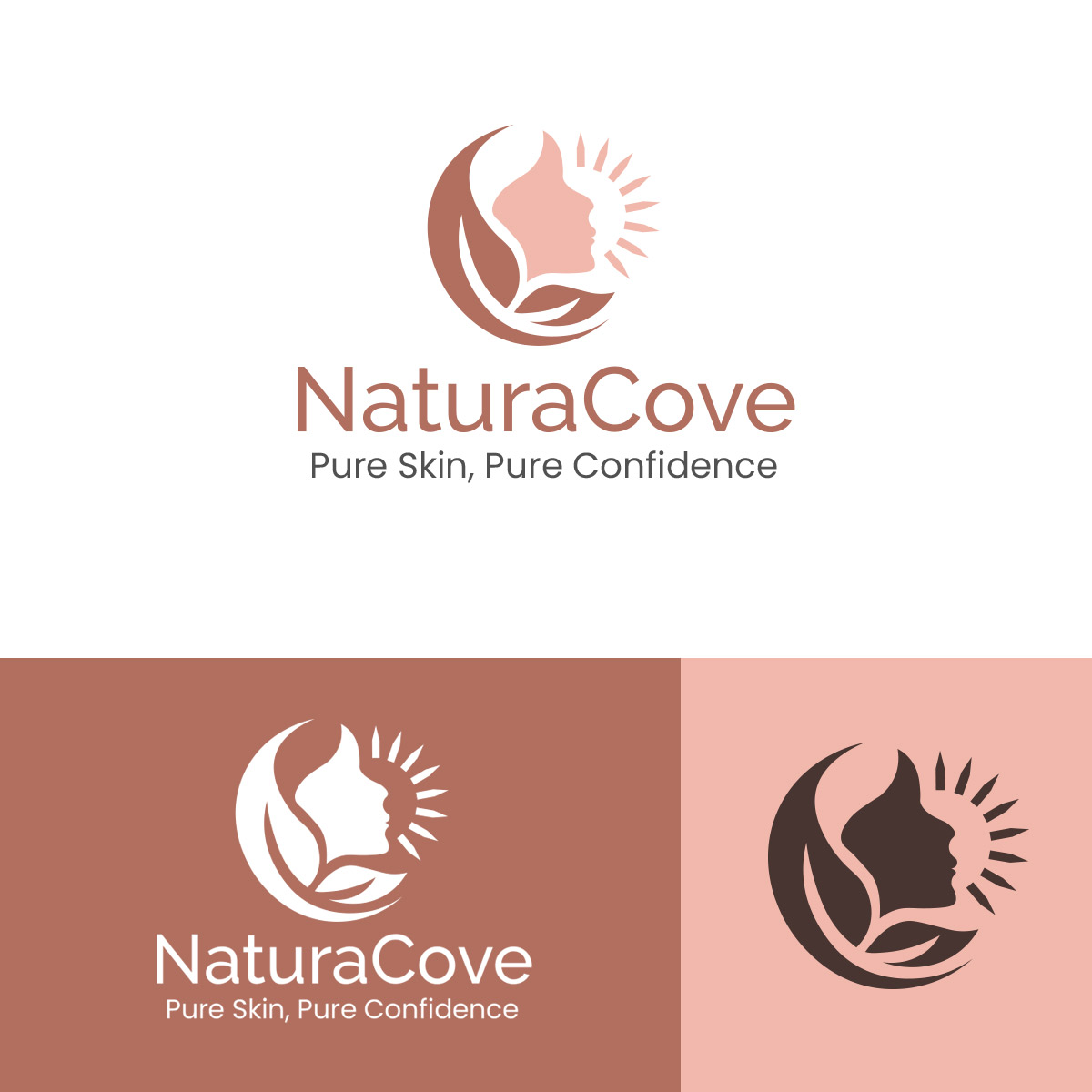
The NaturaCove logo reflects purity, confidence, and natural beauty — the essence of healthy skin. Featuring a graceful face embraced by leaf shapes and sun rays, it symbolizes the harmony between nature and dermatological care. The soft earthy tones convey calmness, wellness, and trust, aligning perfectly with the brand’s promise: “Pure Skin, Pure Confidence.”
Technical / Design-Process Style
The logo began as a hand-drawn sketch to capture natural flow and balance, then was refined in Adobe Illustrator for precision and versatility. The clean vector lines, balanced proportions, and subtle color palette were chosen to express simplicity, professionalism, and purity — making the logo timeless and adaptable across all brand materials.

Creative / Brand-Story Style
The Wanderscape logo captures the spirit of global movement and seamless connectivity. Inspired by the ever-evolving nature of logistics, the design conveys reliability, speed, and a sense of adventure in shipping. The flowing lines and dynamic shapes symbolize the journey of goods across borders, while the bold typography reflects strength and trustworthiness. This logo tells the story of a brand that navigates the complexities of logistics with precision and care, making every delivery a promise fulfilled.
Technical / Design-Process Style
The logo design for Wanderscape combines geometric precision with fluid motion to create a modern, versatile mark. The icon integrates abstract arrows and pathways, representing efficiency and directionality in global shipping. A custom sans-serif typeface was selected for clarity and scalability across digital and print mediums. The color palette balances professional blues with energetic accents, enhancing visibility and brand recognition. Every element was carefully aligned to ensure the logo communicates speed, reliability, and connectivity—core values of the logistics industry.
Creative / Brand-Story Style
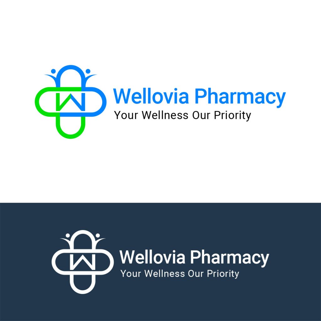
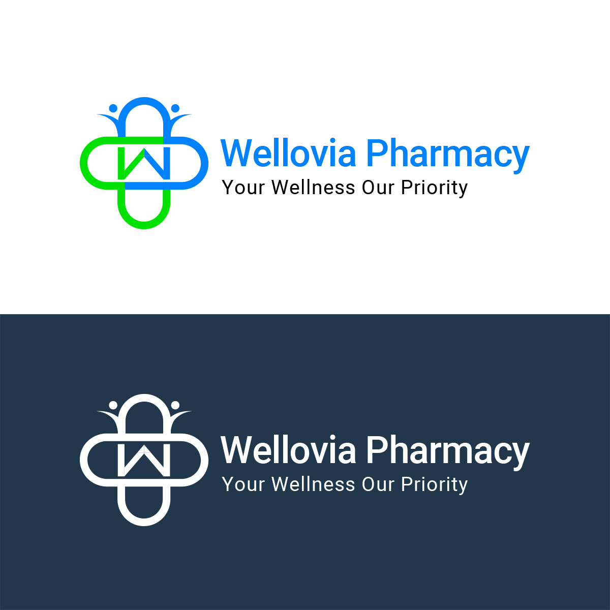
The Wellovia Pharmacy logo embodies trust, care, and wellness at the heart of healthcare. Drawing inspiration from the pharmacy and medical world, the design reflects the brand’s commitment to improving lives through reliable healthcare solutions. Soft, approachable shapes and calming colors convey safety, professionalism, and a sense of reassurance, creating a visual identity that patients and customers can rely on with confidence.
Technical / Design-Process Style
The Wellovia Pharmacy logo was crafted with a focus on clarity, balance, and professionalism. The icon combines abstract medical symbols with clean, modern lines to communicate healthcare, precision, and reliability. A contemporary sans-serif typeface ensures legibility across digital and print applications, while the color palette of calming blues and subtle greens reinforces trust, wellness, and vitality. Each design element was strategically aligned to reflect the brand’s commitment to quality healthcare and patient-centered service.
Logo Design Portfolio
Our portfolio showcases a diverse range of creative logo designs crafted for clients across industries and regions. Whether it’s a modern tech brand, a luxury boutique, or a local business, Flyers4u has designed impactful logos for every field — and we’re always ready to create something extraordinary for you.
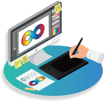
Ready to create your brand’s next iconic logo? Let’s design something unforgettable
Please fill out the form below, and we’ll get back to you as soon as possible.


